
Favicon
A favicon is a small icon that represents your website on the top left corner of a browser tab, and sometimes in search engine result pages.
- Favicons help users instantly recognize your website among multiple open tabs and bookmarks.
- They improve brand recall and make your site look more professional and trustworthy.
- Modern websites need multiple favicon formats and sizes to support desktop browsers, mobile devices, and app icons.
What is a Favicon?
Favicon is the acronym for "favorite icon". It is a small square image which represents your website in browser tabs, bookmarks, address bars, and on mobile devices.
A clear, recognizable favicon helps users quickly identify your website, especially when multiple browser tabs are open. Favicons play a big role in branding, usability, and professionalism.
Favicons are defined using HTML link tags inside the <head> section of a webpage. Since different browsers and devices use different icon standards, websites often provide multiple favicon files, formats and sizes for full compatibility.
Here’s a simple example of how a favicon is added to a webpage:
    <link rel="icon" href="/favicon.ico">

    <link rel="icon" type="image/png" sizes="32x32" href="/favicon-32x32.png">

    <link rel="apple-touch-icon" sizes="180x180" href="/apple-touch-icon.png">
Why Does a Favicon Matter?
Favicon helps users recognize your website instantly, makes your pages look more professional, and improves the overall browsing experience across devices.
Here is why favicons matter:
- Improves brand recognition: A consistent favicon helps users quickly spot your website among many open tabs and bookmarks.
- Enhances user experience: Tabs without favicons look incomplete and are harder to identify, especially when users are multitasking.
- Builds trust and credibility: A missing favicon can make a website feel unfinished or less reliable compared to others.
- Supports mobile and app experiences: Favicons are used when people save your website to their phone’s home screen and in some app like experiences.
A well designed favicon won’t just “look nice.” It helps your website feel complete, recognizable, and trustworthy wherever your pages appear.
Supported Favicon Formats
Modern websites typically use multiple favicon formats to ensure compatibility across browsers, operating systems, and devices. Different platforms look for different icon types, so relying on a single file can lead to missing icons in some environments.
Common favicon formats include:
- ICO: The traditional favicon format supported by virtually all browsers. This format is best and recommended for a broad level compatibility.
- PNG: PNG is a high quality format commonly used for modern favicons (often provided in multiple sizes like 16x16, 32x32, 48x48).
- SVG: A scalable vector format supported by newer browsers.
- Apple Touch Icon (PNG): Used by iOS devices when users save your website to the home screen (common format is 180x180).
- Android / PWA icons: Used for mobile shortcuts and Progressive Web Apps (often included via a manifest.json file).
Using the right mix of formats and sizes helps ensure your favicon displays correctly everywhere your website is seen.
Where do Favicons appear?
Favicons have become an integral part of web navigation and branding, often seen in places you might not initially notice but where they make a difference. Here are some prominent areas where favicons frequently appear:
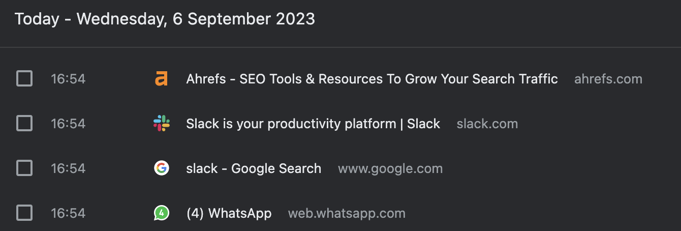
Browser Tabs: One of the most common places is that small icon next to your webpage title, giving a visual cue of the website. Browser History: As users browse, the favicon alongside the website title aids in easily and quickly identifying previously visited sites.
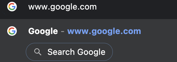
 Search Bar: When typing a URL or searching, the favicon can appear to the left of the website name or URL, helping in quicker recognition.
 Toolbar Apps: Some browser toolbars have shortcuts or apps; a favicon can represent its associated website.
Browser History Dropdown: When you click on a browser's back or forward button, the dropdown list will display the favicon next to each website.
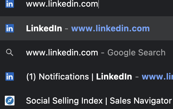
Search Bar Recommendations: As you type, browsers may suggest websites based on history, with the favicon assisting in rapid identification.
Toolbar Apps: Some browser toolbars have shortcuts or apps; a favicon can represent its associated website.
Browser History Dropdown: When you click on a browser's back or forward button, the dropdown list will display the favicon next to each website.
Search Bar Recommendations: As you type, browsers may suggest websites based on history, with the favicon assisting in rapid identification.
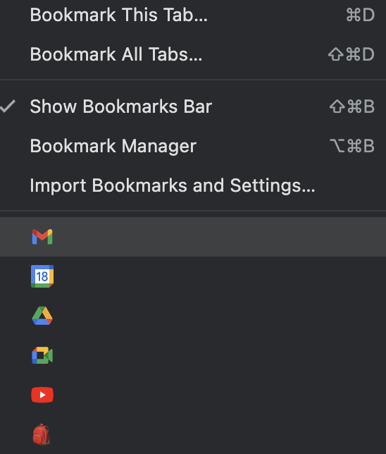
 Bookmarks Dropdown Menu: For users who have bookmarked pages, the favicon next to the title helps navigate to the desired webpage swiftly.
Understanding Favicon Dimensions
Favicons appear in many different places - browser tabs, bookmarks, mobile home screens, and app interfaces. Because each platform has its own display requirements, there is no single “perfect” favicon size.
To ensure your favicon looks sharp everywhere, websites should provide multiple favicon dimensions, each optimized for a specific use case.
Commonly used favicon sizes include:
- 16×16: Standard size used in browser tabs and address bars.
- 32×32: Used for higher-resolution displays and some browser UI elements.
- 48×48: Used by certain browsers and legacy systems.
- 64×64 and above: Helpful for high DPI screens and extended compatibility.
- 180×180: Apple Touch Icon size for iOS home screen shortcuts.
- 192×192 and 512×512: Common sizes for Android devices and Progressive Web Apps (PWAs).
Each favicon should maintain a 1:1 aspect ratio and be designed to remain clear and recognizable even at very small sizes.
Providing multiple favicon dimensions prevents blurry icons, cropping issues, and missing icons across devices.
Do's and Don'ts of Favicons
A favicon might be small, but it appears in high-visibility places like browser tabs, bookmarks, and mobile shortcuts. Following a few simple best practices ensures your favicon looks sharp, loads fast, and works across all devices.
Do's
- Keep the design simple: Use a clean logo mark, symbol, or single letter that stays recognizable at tiny sizes.
- Use a square aspect ratio: Always design favicons in a 1:1 ratio to avoid cropping and distortion.
- Provide multiple sizes: Include common sizes like 16x16, 32x32, 180x180, and 192x192 for broad compatibility.
- Use the right formats: Use ICO for legacy support and PNG/SVG for modern browsers where appropriate.
- Ensure strong contrast: Choose colors and shapes that stand out clearly on light and dark browser themes.
- Place favicon tags in the head: Add the correct <link> tags inside the <head> section of your pages.
- Test across devices: Verify how your favicon renders on desktop, mobile, and different browsers.
- Use transparent backgrounds carefully: Transparency works great for PNG/SVG, but make sure the icon still looks good on different UI backgrounds.
Don’ts
- Don’t use detailed images: Complex logos, photos, or long text become unreadable at 16x16.
- Don’t rely on a single file: One favicon size won’t cover browsers, iOS, Android, and PWAs properly.
- Don’t stretch or crop your logo: Distorted icons look unprofessional and weaken brand trust.
- Don’t forget Apple and Android icons: Missing touch icons can cause blank or generic icons on mobile home screens.
- Don’t use low quality exports: Blurry favicons are noticeable and make your site feel unfinished.
- Don’t place tags incorrectly: Avoid putting favicon tags outside <head> or using broken file paths.
- Don’t change favicons too often: Frequent changes can confuse returning users and reduce brand recognition.
FAQs
The most common size is 16×16 pixels, but modern websites should support multiple sizes like 32×32, 48×48, 180×180, and larger.
Not necessarily. While both represent a brand, a favicon is a small, square icon designed for web browsers. A logo is a broader representation of a brand that can be of various sizes and shapes and is used across various mediums.
Yes. Many brands use a simplified version of their logo or an essential element of their logo as a favicon. However, ensuring the design is still recognizable when scaled down to small sizes is crucial.
No. Multiple sizes and formats are recommended for full compatibility.