
Meta Viewport
A meta viewport tag controls how a webpage is displayed and scaled on different screen sizes, especially on mobile devices.
- The meta viewport tag tells browsers how to adjust page dimensions for responsive design.
- Meta viewport is essential for creating mobile friendly websites that work across phones, tablets, and desktop devices.
- Without a proper viewport tag, pages may appear zoomed out, unreadable, or broken on mobile devices.
- Google considers correct viewport configuration a key requirement for mobile usability and SEO.
- A well configured meta viewport improves user experience, accessibility, and overall website performance on mobile devices.
What is a Meta Viewport?
The meta viewport is an HTML meta tag that tells browsers how to control a page’s width and scaling across different screen sizes, especially on mobile devices.
It plays a key role in responsive web design, ensuring the content adapts properly to phones, tablets, and desktops instead of rendering as a fixed width desktop page that looks zoomed out and hard to read.
The meta viewport tag is placed inside the <head> section of a webpage’s HTML, like this:
<meta name="viewport" content="width=device-width, initial-scale=1.0">
This tells the browser to match the page width to the device’s screen width and load the page at a natural zoom level—so your layout and text are readable from the start.
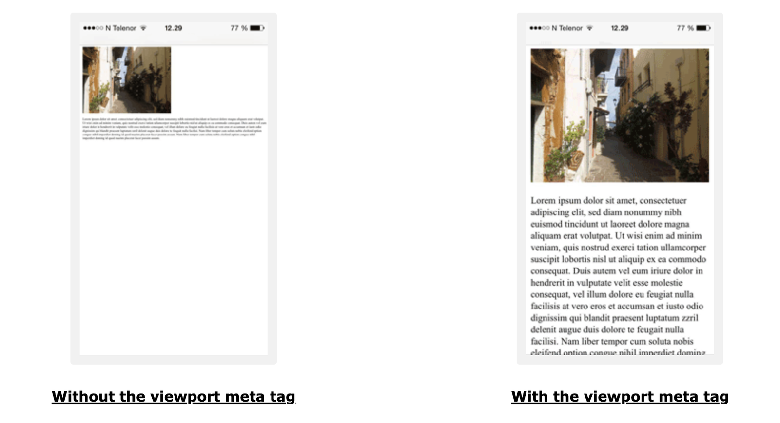
This is how a webpage looks with the meta viewport tag and without the meta viewport tag
How Meta Viewport Works
Before mobile friendly design became an accepted standard, many websites were built only for desktop screens. To make those pages fit on smaller screens, mobile browsers would shrink the entire page to a “virtual” desktop width.
This resulted in the text becoming tiny on the mobile browsers making it difficult for users to read the content of the page. Users had to pinch and zoom, and layouts would often break because the page was not optimised for rendering on a mobile device.
The meta viewport tag fixes this by telling the browser how to size and scale the page on mobile devices. It helps your website:
- Match the page width to the device screen, so content doesn’t render zoomed out.
- Enable responsive CSS to work correctly, especially media queries that adapt layouts across screen sizes.
- Reduce or eliminate horizontal scrolling by making layouts behave as intended on smaller screens.
- Render the page at a sensible zoom level, improving readability and user experience from the first load.
In short, the viewport tag bridges the gap between your design and the user’s screen, ensuring your website is readable and usable across devices.
Good vs Bad Meta Viewport Examples
Let us first understand the most common viewport properties and what they actually do. The "content" attribute inside the viewport tag can include multiple settings that control how a page behaves on different screens.
Common Meta Viewport Properties
- width=device-width – Sets the page width to match the device’s screen width, enabling responsive layouts to render correctly.
- initial-scale=1.0 – Defines the default zoom level when the page loads. "1.0" typically means “no extra zoom.”, which means - render the page as it is without zooming.
- minimum-scale and maximum-scale – Limits how far users can zoom out or zoom in. These are usually unnecessary for most websites but you can set it depending on a specific use case.
- user-scalable – Controls whether users can pinch-to-zoom. Disabling zoom (user-scalable=no) is generally discouraged because it reduces accessibility and takes away the option from users to zoom into the content for reading the content.
Recommended best practice: For most websites, the safest and most widely recommended viewport configuration is:
<meta name="viewport" content="width=device-width, initial-scale=1.0">
Now, let’s look at what good and bad meta viewport implementations look like in practice.
Examples of Good Meta Viewport Usage
| Example | Why this viewport configuration is good |
|---|---|
| <meta name="viewport" content="width=device-width, initial-scale=1.0"> | Clean, modern, and responsive. Matches the page width to the device and loads at a natural zoom level. |
| <meta name="viewport" content="width=device-width"> | Ensures the layout renders at the correct width on mobile devices, which prevents the “zoomed out” look. |
| <meta name="viewport" content="initial-scale=1.0"> | Starts the page at a sensible zoom level. Works well when the site is already responsive via CSS. |
Examples of Bad Meta Viewport Usage
| Example | Why this is bad |
|---|---|
| No viewport tag | Mobile browsers render the page as "desktop width" by default, making text tiny and forcing users to pinch and zoom. |
| <meta name="viewport" content="width=1024"> | Forces a fixed width that breaks responsiveness and often causes horizontal scrolling on smaller screens. |
| <meta name="viewport" content="user-scalable=no"> | Prevents users from zooming, which hurts accessibility and can frustrate users who need larger text. |
| <meta name="viewport" content="initial-scale=2.0"> | Loads the page overly zoomed-in, which can feel jarring and may hide important content “above the fold.” |
Do's and Don'ts of Meta Viewport
A good meta viewport setup is usually simple. The goal is to make your site readable and responsive on all devices without restricting users or forcing fixed layouts.
Do's
- Use width=device-width: This ensures your page matches the device screen width and renders responsively.
- Set a sensible initial zoom: Use "initial-scale=1.0" so your page loads at a natural zoom level.
- Keep it simple: For most websites, a basic viewport tag is all you need.
- Test on real devices: Check your pages on phones and tablets to confirm text size, layout, and spacing feel right.
- Use responsive CSS along with the viewport tag: The viewport enables responsiveness, but your CSS actually makes it work.
- Allow pinch-to-zoom: Let users zoom if they need to - this improves accessibility and usability.
Don’ts
- Don’t disable zoom: Avoid user-scalable=no because it reduces accessibility for users who rely on zoom.
- Don’t hardcode fixed widths: Avoid values like "width=1024", which can break layouts on smaller screens.
- Don’t add multiple viewport tags: Having more than one view port tag can cause unpredictable behavior across browsers.
- Don’t overuse minimum or maximum scale limits: Restricting zoom usually creates more problems than it solves.
- Don’t assume “looks fine on desktop” means it’s mobile-friendly: Always validate mobile layout, readability, and touch spacing.
If you follow these best practices, your viewport configuration will support responsive design, improve mobile usability, and help your pages meet modern SEO and accessibility standards.
FAQs
The meta viewport tag tells browsers how to control a page’s width and scaling on different devices. It ensures your website displays correctly on mobile screens instead of shrinking a desktop layout to fit smaller devices.
The meta viewport tag should be placed inside the <head> section of your webpage’s HTML.
For most websites, the recommended and widely accepted configuration is - width=device-width, initial-scale=1.0
Meta viewport does not have a direct impact on rankings. While it is not a direct ranking factor, it is essential for mobile usability and overall user experience - both of which influence SEO performance indirectly.